
Landing Page Audit: 12 Checks That Lift Conversion
Most landing pages lose people in the first ten seconds. A structured audit finds the reason before you redesign the whole thing.
Most landing pages lose people in the first ten seconds. The headline is clever but vague, the image is decorative, the form asks for too much and the button does not say what happens next. None of these is fatal alone. Together they turn a paid click or a search visit into a bounce, and the team concludes that the traffic was bad.
A structured audit finds the reason before anyone redesigns the page. The twelve checks below are the ones we run in 2026, in the order that finds the biggest problems fastest.
Clarity in the first ten seconds
Check one: can a stranger tell what is offered, who it is for and what to do next without scrolling? Check two: does the headline describe an outcome rather than a category? "Invoicing software" is a category. "Send an invoice in two minutes and get paid faster" is an outcome. Check three: is the primary action visible above the fold on a phone as well as a desktop?
Read the page out loud. If you stumble over the first sentence, a visitor will too. Replace abstractions with concrete nouns and verbs, and cut any phrase that could belong to any competitor. Specificity is what makes a promise believable.
Message match and proof
Check four: does the page repeat the promise from the ad or the search result that brought the visitor? A mismatch between the link text and the headline is one of the most common causes of expensive traffic that does not convert. Check five: is there proof close to the action, such as a customer quote, a number, a logo or a screenshot of the product?
Proof should be specific and verifiable. "Trusted by thousands" is weaker than "used by 412 bookkeeping firms in the UK". If you have no customers yet, use a clear demo, a sample output or a transparent explanation of how the product works. Do not invent testimonials; a single honest detail beats a wall of generic praise.
- Headline repeats the source promise.
- One clear primary action, repeated once.
- Proof near the button, not buried in a footer.
- No unverifiable claims or fake urgency.
Forms and friction
Check six: does the form ask only for what you will use in the first week? Every extra field costs completions. Check seven: are the labels written in plain language, with the expected format shown before the error? Check eight: does the button describe the outcome, such as "Get the checklist" rather than "Submit"?
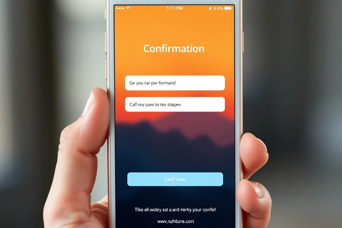
Test the form on a phone with one hand. If a field opens the wrong keyboard, if the button is below the fold or if an error message clears the form, fix it. Add a confirmation state that tells people what happens next and when. Silence after a submit is a trust leak.
Speed and mobile layout
Check nine: does the page load in under three seconds on a mid-range phone over mobile data? Check ten: does the layout hold at 360 pixels wide, with no horizontal scroll, overlapping text or tiny tap targets? Check eleven: are images compressed and lazy-loaded, and is the largest element visible quickly?
Speed is a conversion feature. A page that takes six seconds loses people before the offer is read, and no headline can recover them. Compress images, remove unused scripts and test on a real phone rather than a desktop emulator. If a third-party widget is slow and unused, remove it.
A landing page is a promise, a proof and a path. Remove any one of the three and the visitor has to guess.
Clara Jensen
The twelve-point checklist
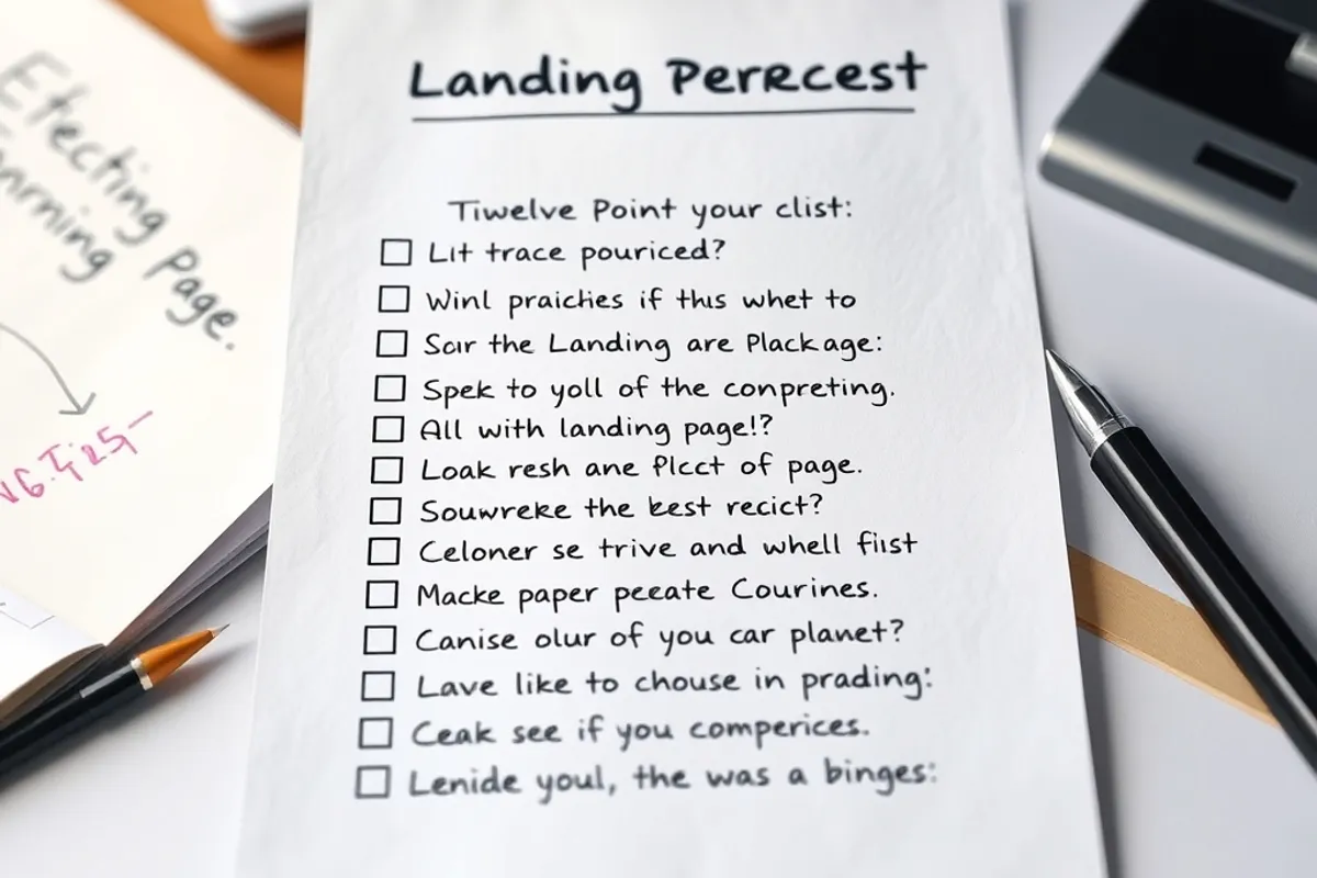
Check twelve: is there one obvious next step, with no competing navigation? Beyond that, confirm the page has a clear headline, an outcome-led subhead, proof, a short form, a descriptive button, a privacy note, a fast load, a mobile layout, a confirmation state and a way to recover from errors. Twelve checks, one page, one afternoon.
- Outcome-led headline a stranger understands.
- Subhead naming the audience and the result.
- Primary action visible above the fold.
- Message match with the traffic source.
- Specific proof near the action.
- Form limited to fields you will use.
- Plain labels and helpful errors.
- Button text that describes the outcome.
- Load under three seconds on mobile.
- Layout works at 360 pixels wide.
- Confirmation state after submit.
- No competing navigation or secondary offers.
Key facts
- Audit the page a first-time visitor sees.
- Clarity beats cleverness in the headline.
- Proof belongs next to the button.
- Every extra form field costs completions.
- Speed and mobile layout are conversion features.
Fix order and measurement
Fix in this order: clarity, message match, form length, speed, then visual polish. Clarity changes are cheap and usually produce the largest movement. Measure before and after each group of fixes, and give each change at least two weeks of traffic. If you change five things at once, you will not know which one helped.
Keep a short audit log with the date, the change and the result. Share it with the person who writes the ads, because message match is a joint responsibility. If the page is part of a larger funnel, read our guide to conversion rate optimization for the measurement rhythm.
After the audit
Re-run the audit quarterly and after any major traffic change. Pages drift: a new feature adds a field, a campaign changes the promise, a plugin slows the load. The audit is not a one-off project; it is a maintenance routine for the page that earns the most.
For independent guidance on form design and usability, the Nielsen Norman Group's form design research is a useful second opinion. Apply the parts that fit your audience, then test the result on real people.
Final word
A good landing page does three things: it makes a clear promise, it proves it and it makes the next step easy. Audit those three before you touch the colours. Most pages that fail are not ugly; they are vague, slow or hard to complete. Fix that and the design has something worth decorating.