

Conversion Rate Optimization: Where to Start on a Small Site
You do not need a research lab to improve conversion. You need one clear funnel, honest numbers and the discipline to change one thing at a time.
Conversion optimization has a reputation for being a specialist sport: heat maps, multivariate tests, statistical significance. For a small site, that reputation is unhelpful. Most of the gains come from unglamorous fixes: a clearer promise, a shorter form, a faster page and a button that says what happens next. You do not need a research lab to find those.
This guide is the starting sequence we use when a site has traffic but few enquiries. It assumes one person, one funnel and a budget of time rather than software.

Define the one conversion that matters
A conversion is not every click. Pick the single action that moves the business forward this quarter: a booked call, a paid order, a completed application. Write it down with the page where it happens and the value of one conversion. Everything else is a micro-conversion that supports it.
If you cannot name one action, you cannot optimize. A site with five equal calls to action splits attention and makes measurement meaningless. Choose the primary action, make it visually dominant and treat the others as secondary links.
Measure the funnel honestly
You need three numbers per step: how many people arrive, how many continue and how many drop. For a simple funnel that is visit, start form, submit. For a shop it is product view, add to cart, checkout, payment. Instrument each step before changing anything, or you will not know whether a fix worked.
Use the analytics you already have, plus a manual count of enquiries for a week. Small samples lie, so look at direction over a month rather than a single good Tuesday. Exclude internal traffic and obvious bots. If the numbers do not reconcile with your inbox or your bank, fix the measurement before you touch the page.
- One primary conversion, with a defined value.
- Every funnel step tracked, including failures.
- Internal traffic excluded from reports.
- A manual count to sanity-check the dashboard.
Find the biggest leak first
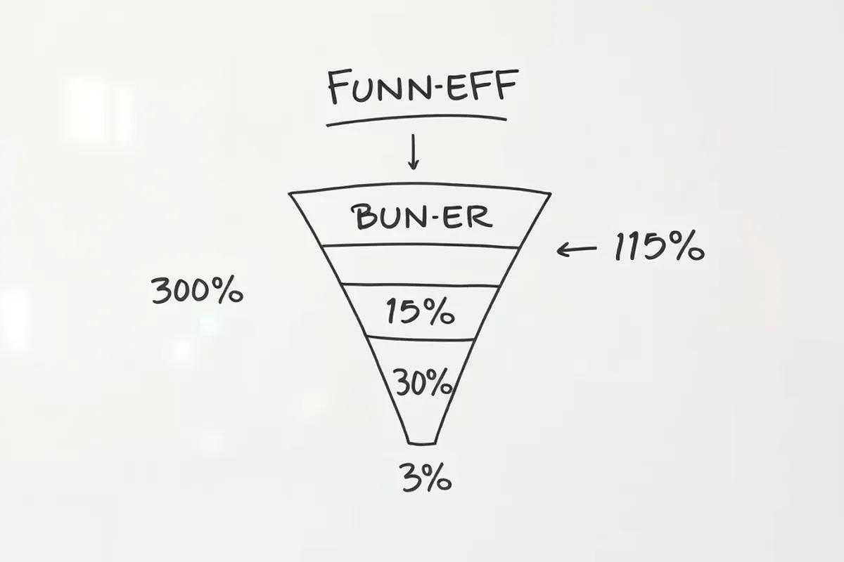
Plot the funnel and look for the step with the largest drop relative to its importance. A landing page that loses 80 percent of visitors before they read the offer is a bigger problem than a checkout field with a minor hesitation. Fix the largest leak first; the smaller ones may disappear when the flow improves.
Read the page as a stranger. Can you tell in ten seconds what is sold, who it is for and what to do next? If not, the leak is clarity, not persuasion. If the promise is clear but people leave at the form, the leak is friction. If they start the form and abandon it, the leak is trust or effort.
Fix friction before testing
Friction is anything that makes the next step harder than it needs to be. A form asking for a phone number when email would do. A required account before a free download. A page that takes six seconds to load on a phone. A button labelled "Submit" instead of "Get the checklist". These are not hypotheses; they are known costs, and they should be fixed without a test.
Shorten forms to the fields you will actually use. Move trust signals next to the action. Make the button describe the outcome. Remove navigation from a dedicated landing page. Each change should make the path shorter or clearer, and each should be small enough to verify in the analytics within two weeks.
Most conversion problems are not persuasion problems. They are clarity and effort problems wearing a marketing costume.
Clara Jensen
Run one test at a time
Once the obvious friction is gone, test one change at a time. A test needs a clear hypothesis, a single change and a success metric agreed in advance. "A shorter form will increase completed applications" is a test. "Redesign the page" is a project, and it will tell you nothing about which part worked.
For small traffic, do not wait for statistical significance on a 2 percent lift. Test changes large enough to matter: a different offer, a different form length, a different proof section. Run each for at least two full weeks and compare like with like. If traffic is very low, prefer sequential before-and-after comparisons with a stable period on each side.
Key facts
- One primary conversion, one defined value.
- Track every funnel step, including failures.
- Fix the largest leak before optimizing smaller ones.
- Remove known friction without a test.
- Test one meaningful change for at least two weeks.
What to ignore
Ignore redesigns driven by taste, competitor envy and conference slides. Ignore tiny button-colour tests when the page has no clear promise. Ignore any tool that reports a score without showing the underlying data. And ignore advice that treats every visitor as identical; a returning customer and a first-time reader need different pages.
Also ignore the urge to optimize before you have traffic. If twenty people visit a week, a conversion test cannot produce a reliable answer. Spend that time on distribution and on making the offer clearer, then return to testing when the sample can support it.
Build a monthly rhythm
Conversion work is a habit, not a campaign. Once a month, review the funnel, pick the largest leak and make one change. Record what you changed, when and what happened. Over a year that is twelve documented improvements, which is more than most small sites achieve in three.
Keep the record short: date, page, change, metric, result, next step. Share it with whoever writes the content, because copy and layout decisions belong together. If the site is new, pair this rhythm with the landing page audit and the keyword research workflow so traffic and conversion improve together.

Final word
Conversion optimization on a small site is mostly common sense applied consistently. Name the action, measure the path, fix the biggest leak and change one thing at a time. Do that monthly and the site gets easier to use, which is the only durable route to more conversions.
For a structured way to review the page itself, the Nielsen Norman Group's usability heuristics remain a practical checklist. Use them to find friction, not to justify a redesign.